
If you’d like to see some of our adventures in RMNP, click here! One of our fondest memories is this winter van camping trip!
I love (LOVE) living so close to Rocky Mountain National Park. It’s the closest that I’ve ever lived to a national park, and every visit puts a big smile on my face. Needless to say, when I came across the Subpar Parks account, I couldn’t stop laughing.
Subpar Parks
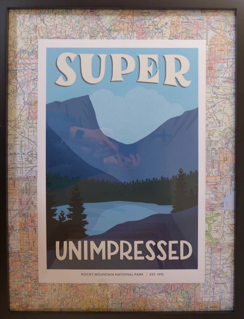
Illustrator Amber Share pairs negative reviews of the national parks with her own illustrations. She’s created an illustration for each US national park and has now moved on to parks in other parts of the world. I mean, I guess her work is funny. Would you believe me if I said I’m super unimpressed?
My sister gave a few of the prints for gifts this year. You can find prints, postcards, stickers, and more in Amber’s shop, but there seems to be a larger selection of print sizes if you order from the Albion Mercantile shop. I was the lucky recipient of a RMNP print, and was excited to get this baby on the wall.
Framing Your Print

My print is the 13 x 19 inch size, so I picked up this 18 x 24 inch frame from target. The frame is only $23 and I think it’s great quality for that price point. The size difference gave me a 2.5inch board to fill with a mat (now’s the moment when I confess that I always think mat should end with two ts, unless it’s the mat that goes on the floor, that one should only have one t).
I’m a fan of unique mats. I think they’re a simple and great way to personalize art. Here’s an example of a balsa wood mat that I used when framing a poster for our bedroom. It definitely helped to make the mass-production poster feel more like art. In this case, I wanted to play off the poster’s contrasting themes, so I thought I’d pair the print with old city maps.

This is the moment that I remind you to never throw away old atlases! They come in handy for so many projects. This atlas was on the smaller size, but I’ve been tearing out the maps for wrapping paper, craft projects, and now this. Remember friends: reuse BEFORE recycle.
What do you think?
As you can see, this project didn’t take much precision. I cut out a bunch of maps and use the best and busiest city sections. I used double-sided tape to attach the maps to the paper that was already in the frame. Once that was done, I centered my print and taped it down with the double-sided tape.

I love that the maps add a bit more color to the piece. When you get up close, the maps are obviously very busy, but they are pretty equally packed with roads, words, and colors, so overall there’s not one particular section that is too jarring and it creates an even tone for the mat(t).
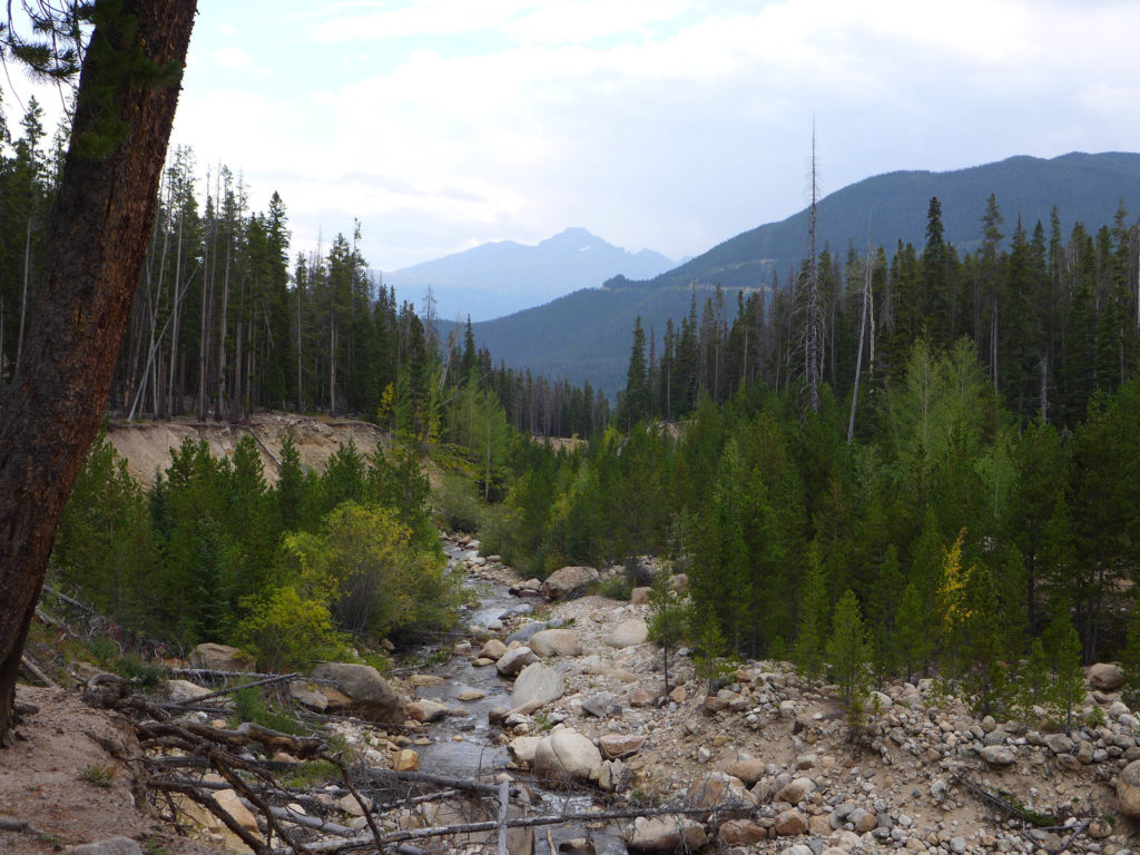
The illustration on the print reminds me of the 1st photo in this post; it’s one that I took during a hike in RMNP. We don’t have many photos hanging on the walls, but I love that we’ll have this print to remind me of how lucky I am to live so close to a national park. <3