A couple of weeks ago we gave you a little tour of Alex’s finished bedroom with the promise that we’d be back to discuss the mural in greater detail. Well, today’s the day, and we’re ready to share both the highs and lows (there definitely were some!) of this project. If you want more background information, in the last post, we discussed why we wanted to do a big mural with some discussion of how the mountains fit in with our woodland theme.
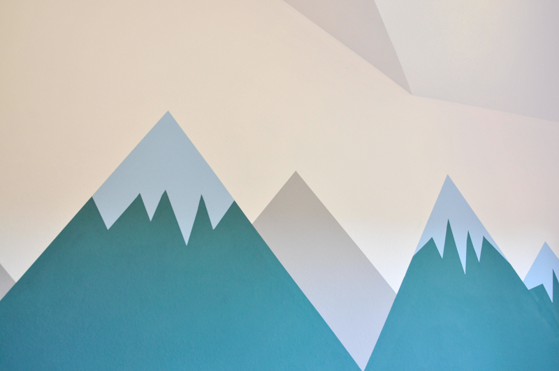
As I mentioned in the last post, our inspiration for the mural came from this nursery designed by Emily Henderson. The first thing I did was to sketch out an overview of the mountain landscape that we would try to reproduce. Keeping in mind that odd numbers are more appealing to the eye than even, I went with five mountain peaks. I tried to stagger the heights, while keeping a natural perspective in mind, which meant making the background mountains shorter (these are also the ones that would be painted gray).
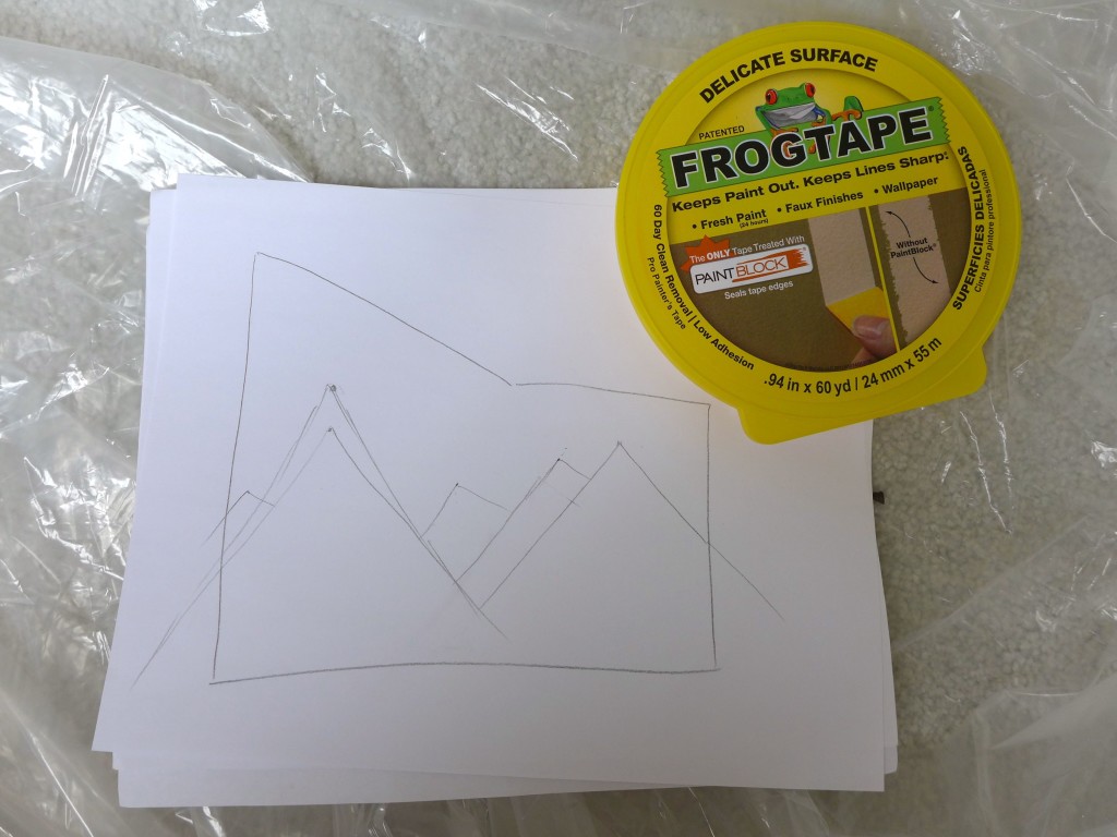
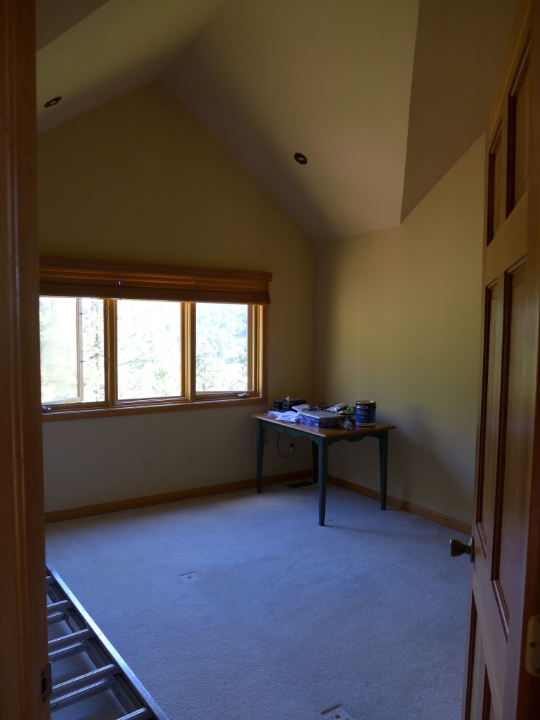
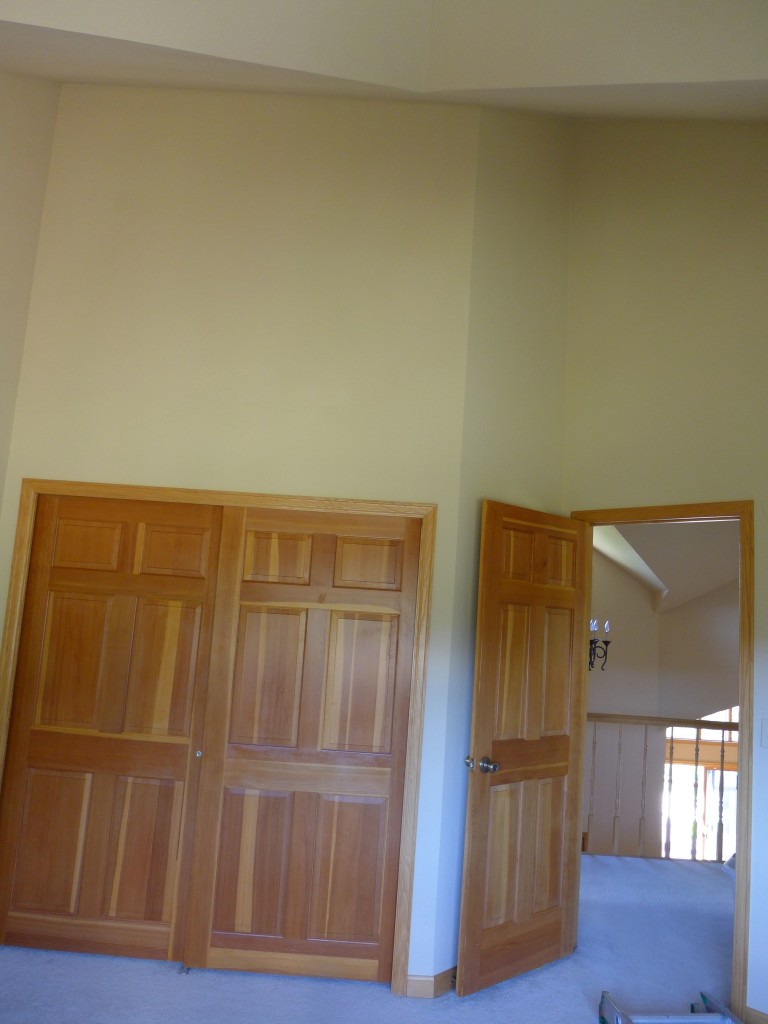
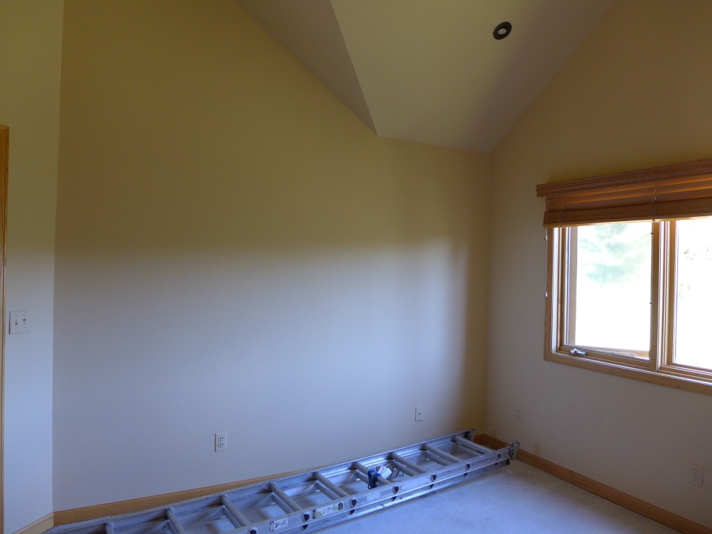
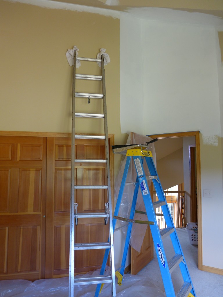
So, with that sketch in mind, let’s take a step back and look at what the whole room looked like before we started painting :
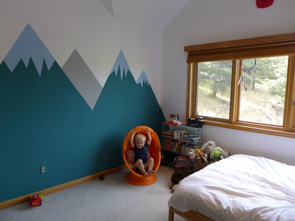
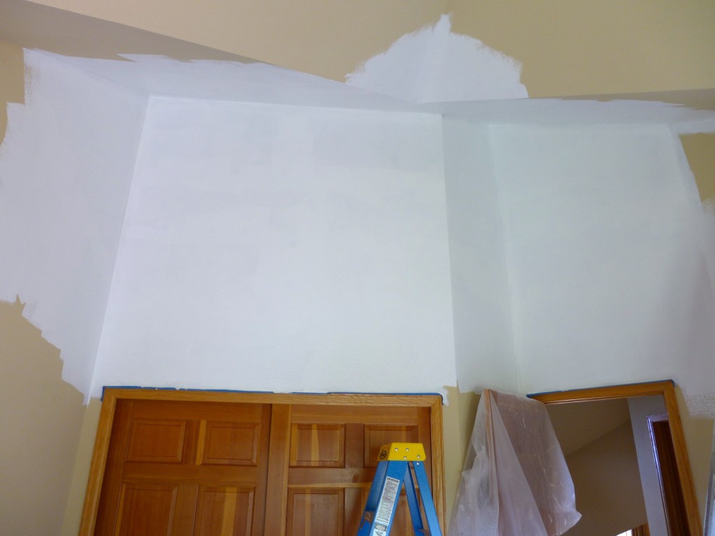
That last picture above shows you the wall where the mountains will go. It may be hard to tell from those photos, but the walls were painted a light beige color. It truly didn’t look that dark, but once we started painting them “pure white”, the change was dramatic!
We went with a semi-gloss finish, which may seem odd for bedroom walls, but we did it for two reasons : 1. we wanted to be able to easily wipe messes off the walls (little boys live here), and 2. I wanted to use a matte or chalkboard type paint for the mountains, so I though the contrast in finish between the two paints would add a nice bit of texture to the room.
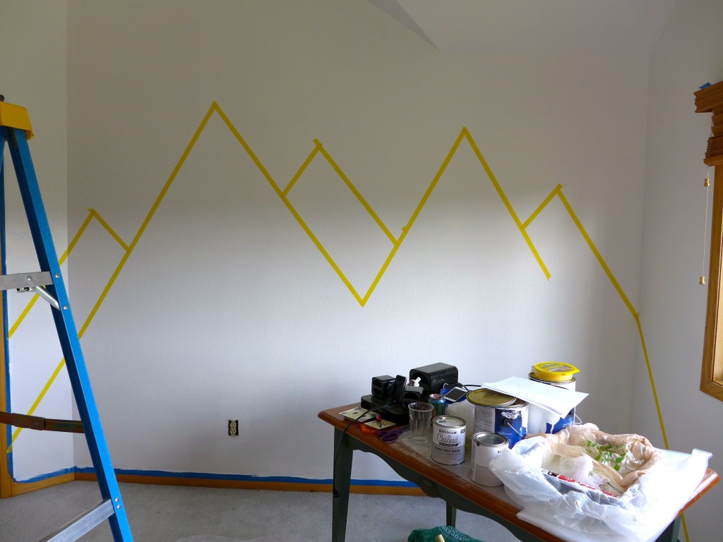
Unfortunately, we had to give the whole room two coats of white paint, but it was totally worth it to produce such a nice, clean finish and eliminate any mottling. Once the walls were white, I went back to the sketch and taped our mountain outlines to the wall.
The taping was all done freehand, without making any sketching or marks on the wall. Once an outline was up, I played with height and slope of a couple of the peaks until everything looked just right. Then it was time to begin painting.
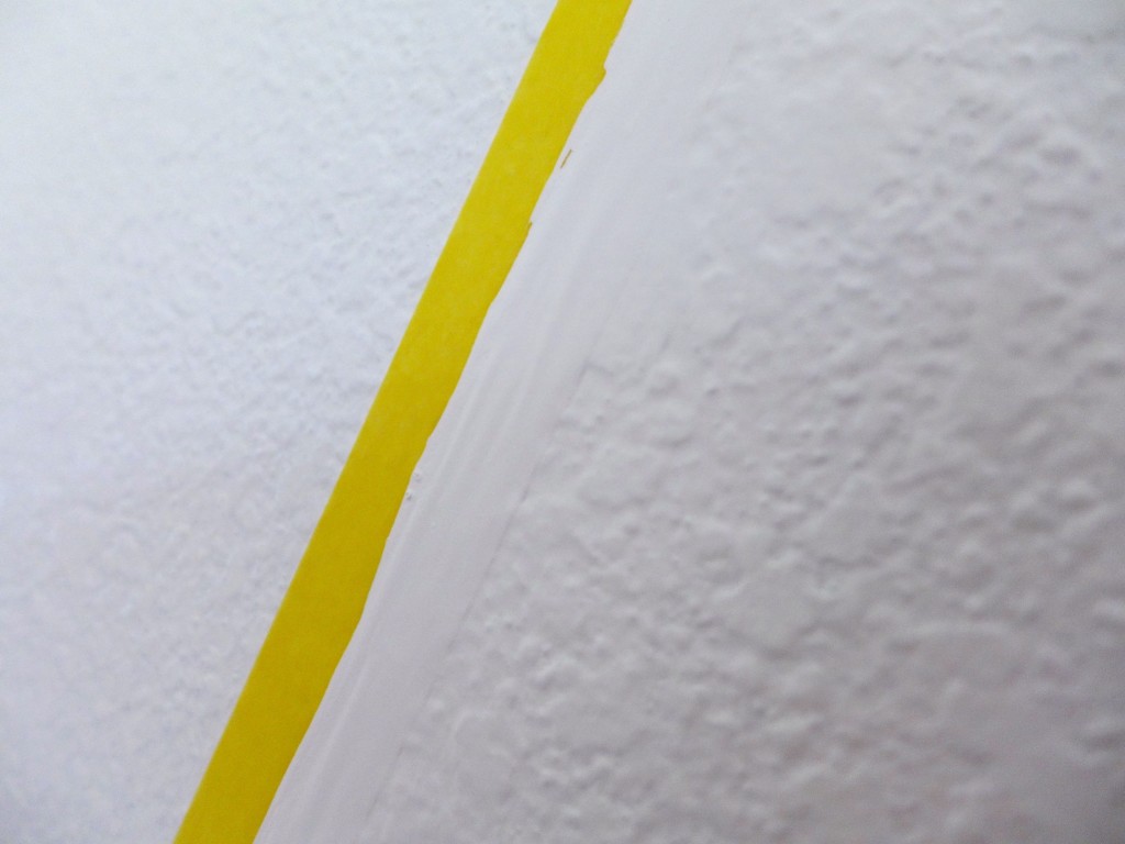
As you probably noticed, our walls are highly textured. I wasn’t excited about the finish when we moved in, but it’s slowly growing on me. The problem is that when you want to paint a sharp line on the textured wall, you have to be very careful, because it’s hard to get the painter’s tape to stick in every nook and cranny. The way to remedy this problem is with more paint…
On the side of the tape that is going to have the color (in our case this is the same side that create the mountains’ edges), begin by painting more of the background wall color. The paint should go up over the edge of the tape, and most importantly, it should seep under the tape and into any open spaces along the textured wall. The paint will help to create a tight seal between the tape and the wall, blocking out the new color paint that you are about to apply.
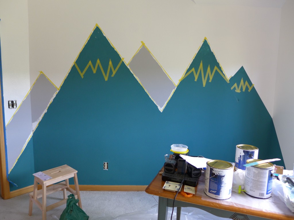
So, with all of the tape edges painted white, I then added the green and gray colors for the mountains.
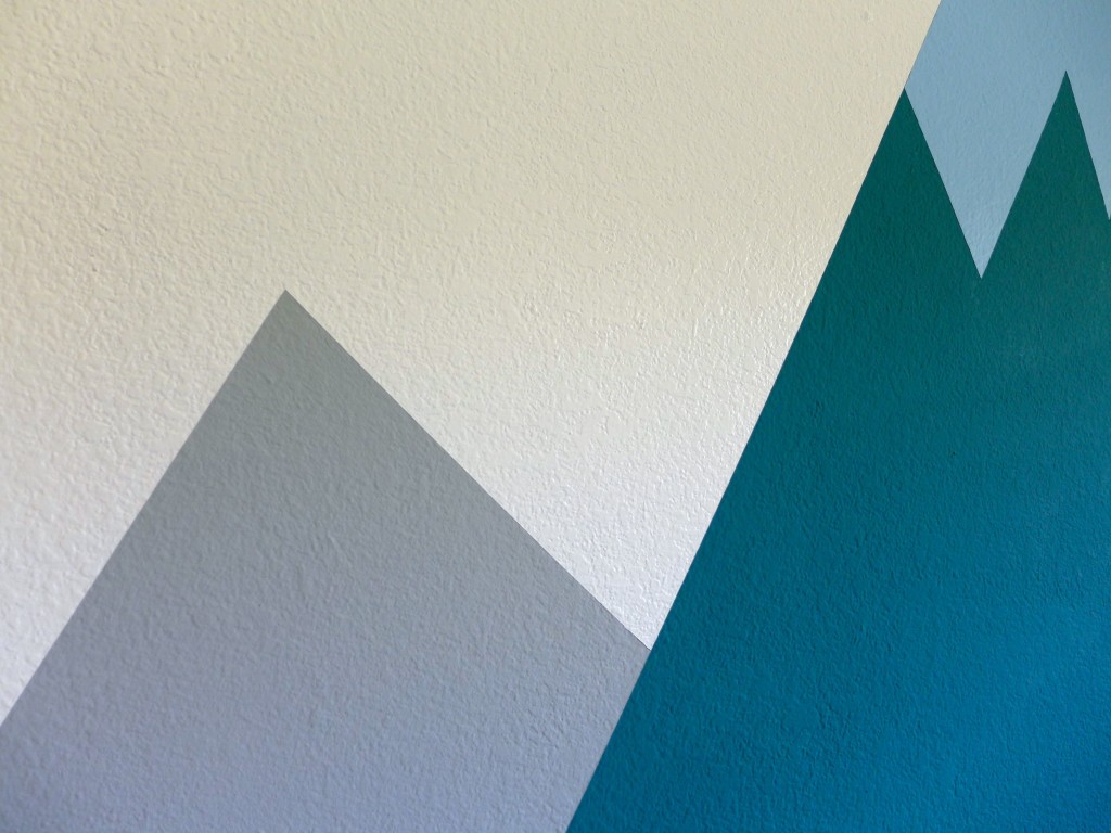
You can see that the gray mountain edges are not sharp where they would meet the green mountains. This is because I had to lift up the initial taped line, which marked off the outermost edges of the green mountains, and apply new tape so that it delineates the final sharp line between the green and gray mountains. Once that new tape is applied, I had to again apply a “pre” coat of paint to seal the tape’s edge. This time we have to use green paint, because it’s sealing off the “background” green mountain color from the gray that we’re about to apply. Does that make sense?
I thought I had pictures of each step, but I must have gotten camera fatigue halfway through the project.
Once the gray mountains were complete, it was time to apply the tape for the blue snow-capped peaks on the green mountains. This process was similar to what I just described. I taped off the space. Then I used green paint to seal the edges of the tape that would form the line between the green mountain and the blue area and used white paint to seal off the paint that formed the border between the blue area and the white walls.
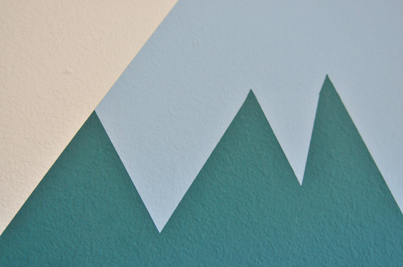
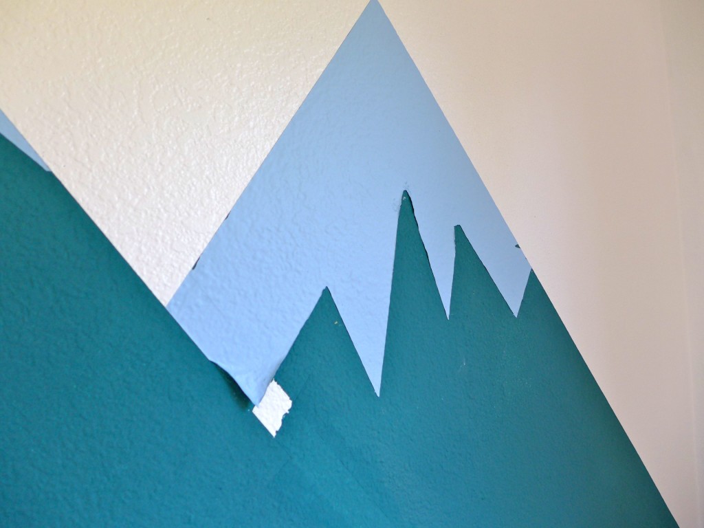
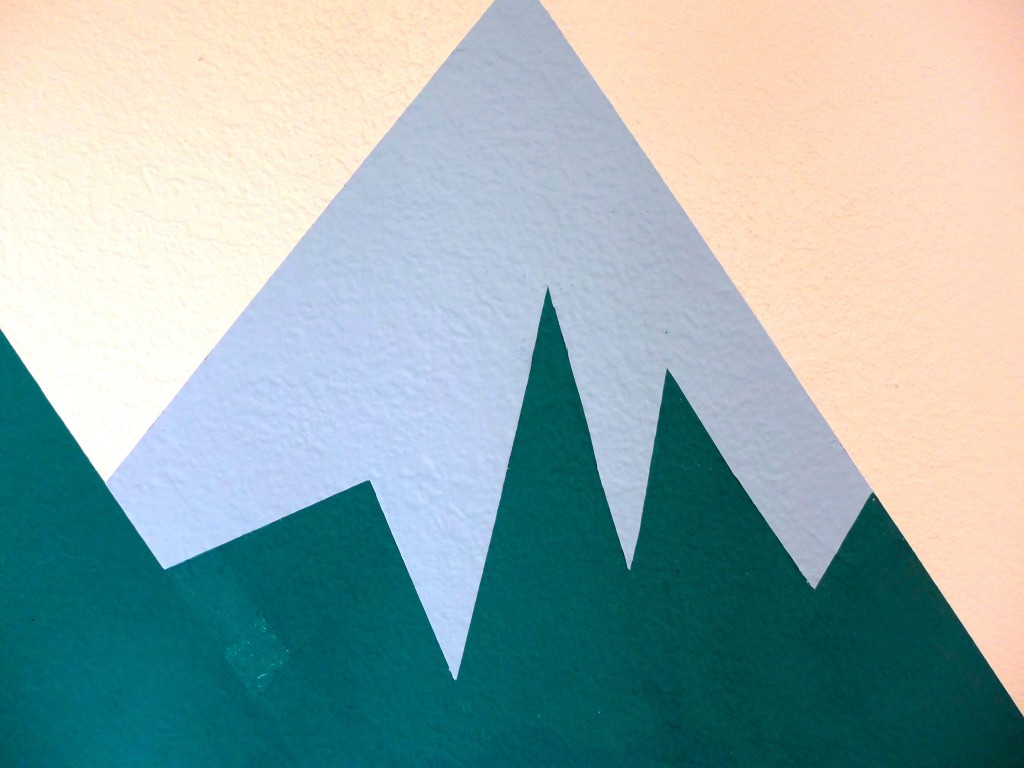
When the paint dried and the tape was pulled off (always at an angle to the wall!), a nicely finished mountaintop looked something like the photos above. Unfortunately, I also ended up with one messy mountaintop…
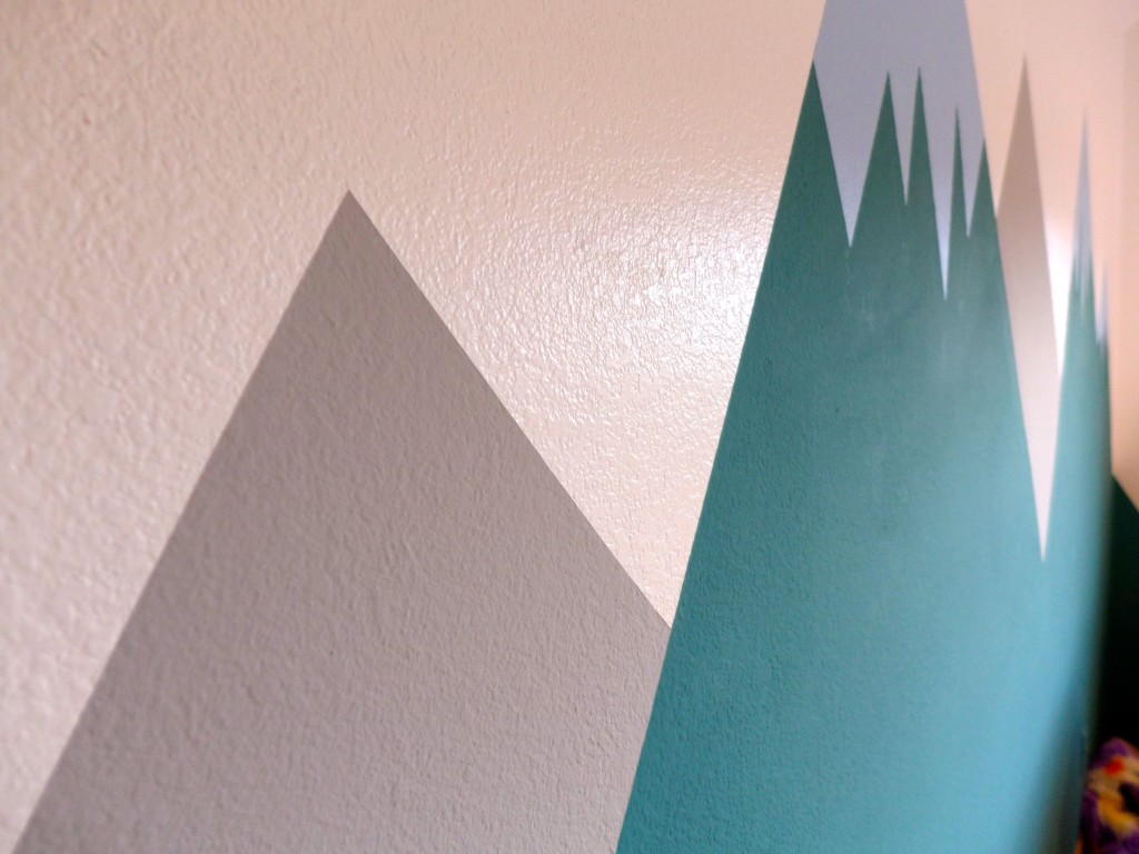
I think you can see what’s going on there? The layer of blue paint pulled away from the wall when I removed the tape. I think the issue was the thick green paint – when I used it to seal off the tape, I think it worked too well, and so when I pulled up the tape, that green paint came with it, thereby also pulling up the blue painted that was applied on top of it. In addition to that glaring problem, I also had a few areas where the line between the mountaintop and white wall was uneven (from blue paint coming up with the tape and exposing the green background).
(The white area in the photo above is not an accident or problem outcome. It’s just a mistake due to forgetting to remove a piece of tape; easily remedied by touching it up with green paint. At least all of the painting mistakes were contained on this one sad little mountain.)
At first I was frustrated and tired after spending close to a week working on painting the whole room. So, I walked away. I knew that walking away and taking a moment to think about the problem was better than any rash ideas.
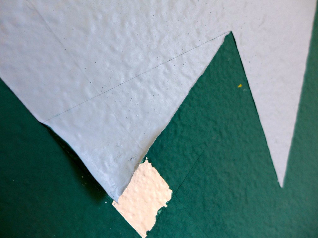
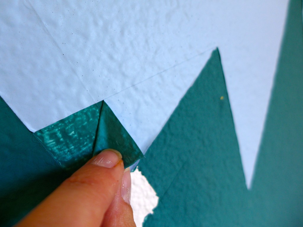
So, after a bit of brainstorming and discussion, I have to give Calder full credit for coming up with the final solution. Using a ruler and an exacto knife, I carefully scored the blue paint at a new angle that was above the damaged area (you can see the score line in the photos above). After scoring the paint, I very carefully and slowly pulled the layer of blue paint off the wall, and you can see that paint remained attached to the wall above the score line but easily pulled away below, creating a new, perfectly straight edge between the blue mountain peak and green mountain.
I used this technique to clean up any blue edge where the paint had pulled away. After the new straight lines were in place, I went back with the green and blue paint and touched up any areas that needed it. The solution worked perfectly, and the only side effect was that I had some snowcap angles that were a little funky compared to my original vision, but all in all, I can’t complain, and maybe the funky lines just add a bit of whimsy to the room? What do you think?
I’m so happy that we were able to find a solution that didn’t require major work…. of course, you can also see that that white area in the middle of the mountain could still use a second coat of green paint. Ugg! Sarah and I talk about the fact that we are such lazy finishers. There reaches a point when we stand back, take in the big picture and say “that’s good enough” even if we know that there are a few minor details left unfinished.
What about you? Can you stick it through to the tedious end? Or are you antsy to move on to the next exciting project?

This looks awesome. Could you please share the paint color you used? Thanks!