Hey there! If you’ve been following along, you may know that Calder and I bought a house in March and moved in a week or so before little Luc was born. It could have been a crazy and hectic time, but all in all, it wasn’t that bad (really!). We were lucky that our new house was in great shape did not require any major work. In fact, the only thing I want to change about the house are the colors of the walls. The walls are painted shades of beige. It’s nice enough that we can live with them for a while, but eventually I would love to brighten everything up and paint most rooms white.
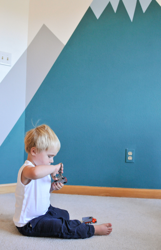
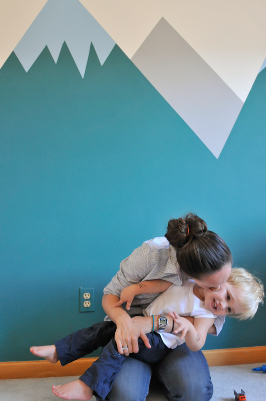
To give you an idea of where I’m going: between the mountain views outside our windows, the wooden trim and furniture, and eventual white walls, I’m feeling inspired my many of the elements common to Scandinavian design. I want to add pops of color with the artwork on the walls, the furniture and other elements that can easily be changed within the rooms. That said, we took a big risk and added a huge mural across one wall in Alex’s room. Luckily it turned out great! Today I’m going to share snapshots from his room and in a follow-up post I’ll provide a more detailed tutorial and tips about how we painted the mural.
We started our house painting/room decorating with Alex’s room because we were anxious to create a space for him that was bright and happy (eventually this room will be shared by both boys). We wanted to make a place where he could retreat if he wanted some solo play time or wanted to settle down for some quiet reading. We were also motivated to start with his room because we wanted to transition him out of his crib and into a big bed. This may not work for other kids, but we thought he would love the fanfare if switching beds was combined with the makeover. Luckily he was psyched by the whole process of both “building” his room and sleeping in his “new” bed!
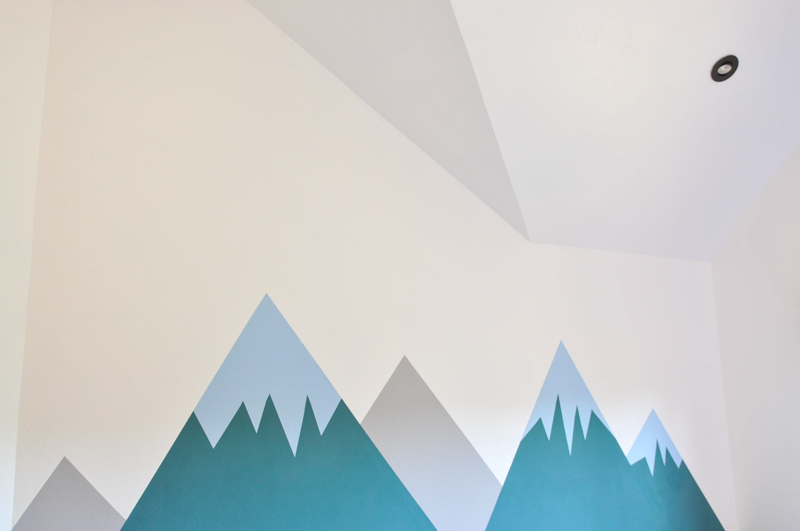
While the footprint of the room is average for a bedroom, the vaulted ceilings make the room feel like a really big space. I was worried that his toys and furniture might be dwarfed by such high ceilings and white walls, even after adding a few pieces of art to the walls. So I wanted to do something “big” in the room to fill out the space, and that’s what led to the mural. While we were willing to do something risky, I also wanted to keep it simple enough so that we didn’t get ourselves in over our heads (that said, this weekend project ended up taking the better part of five days to complete!). In the planning stages, I remembered seeing this nursery designed by Emily Henderson and loved the simplicity of the mountains.
Ugg, and the walls are all painted “pure white”, which is just the untinted white produced by the painted company. It really is as white as white can be. In some photos it comes off a bit off-white, but this room is on the north side of the house, and I think we’re just getting some shadows from shooting late in the day.
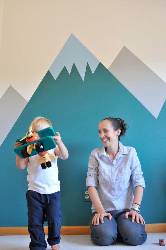
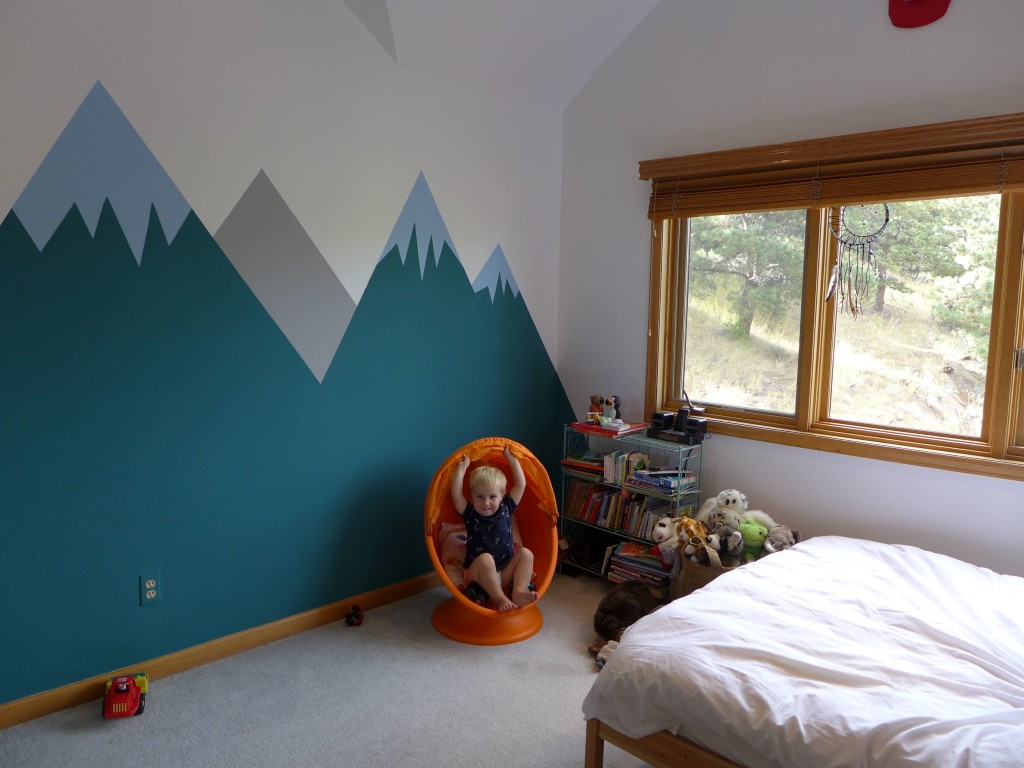
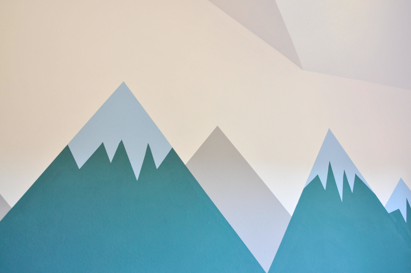
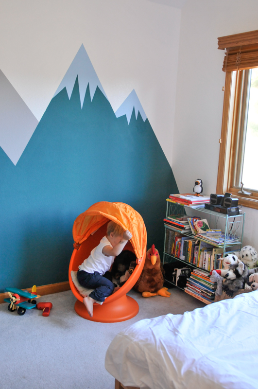
As you can see, we changed the color of the mountains, but used the same simple design with a lot of straight lines and just three colors. The mountains take up one full wall of his room, and on each side the wrap around the corners to the neighboring walls. Mountains seemed like the perfect backdrop for Alex in so many ways. Since moving to our house, we now refer to him as a “mountain boy”. He’s always had an affinity for nature, which is great, because I really wanted to do a woodland-themed room for him (this pinterest board has been in the works since he was just a few months old). And finally, Calder and I just loved the idea of his bedroom wall mirroring the beautiful Rocky Mountains right outside our door.
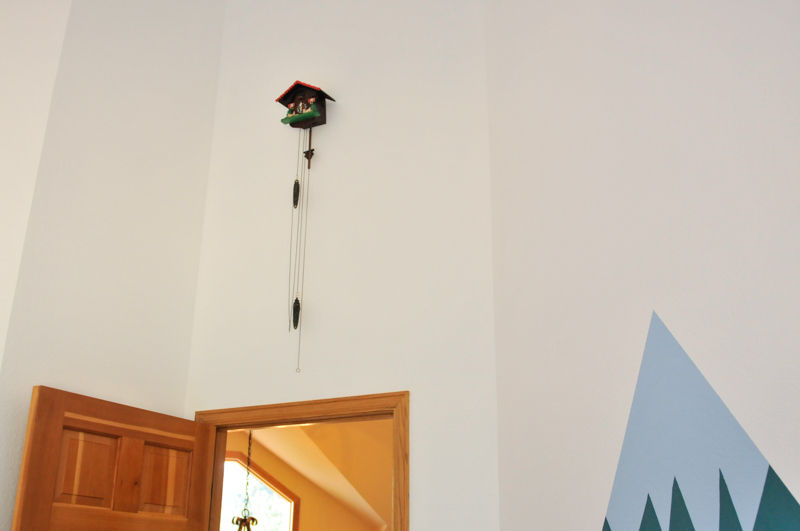
In addition to the mountains, we created that woodland theme with a few, very simple elements. Above the doorway, I hung a cuckoo clock that I bought on a trip to Switzerland. I’ve been wanting to hang it, but didn’t want its chains within reach of the boys. Above the door was perfect out-of-the-way place, but it’s also a great way to fill out this tall skinny space that would could have just been a void in the vaulted ceiling. I think that photo also helps to give you a sense of the scale of the mountains. Sidenote : I loved the idea of a collection of cuckoo clocks, but soon discovered that Calder couldn’t stand the sound of a ticking clock! So it’s no problem at all that the clock’s too high to actually use.
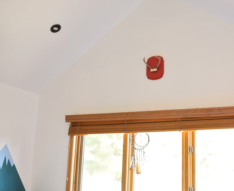
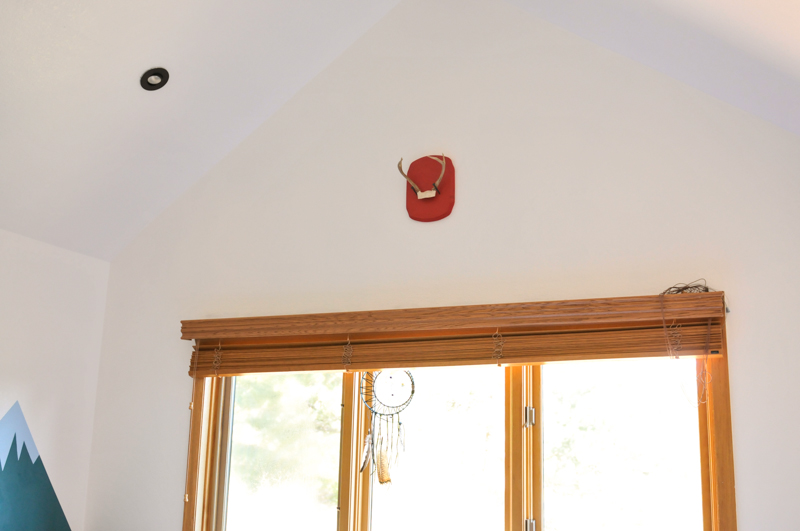
Above his window is an antler that I picked up at our favorite county fair in PA. I “mounted” it on a wooden plaque from Joanne’s. The plaque was spray painted red, and then I hammered in two huge hand-forged nails that I bought at Atomic Garden (one of my favorite shops!) on a previous trip to Oakland. The antlers are just sitting on the nails, and I thought this was a great way to make them accessible if Alex wants to explore them a bit. In the window is a dream catcher that was made for Alex by our sister, Kristin!
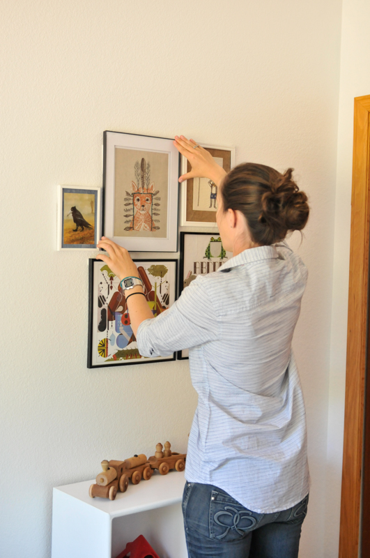
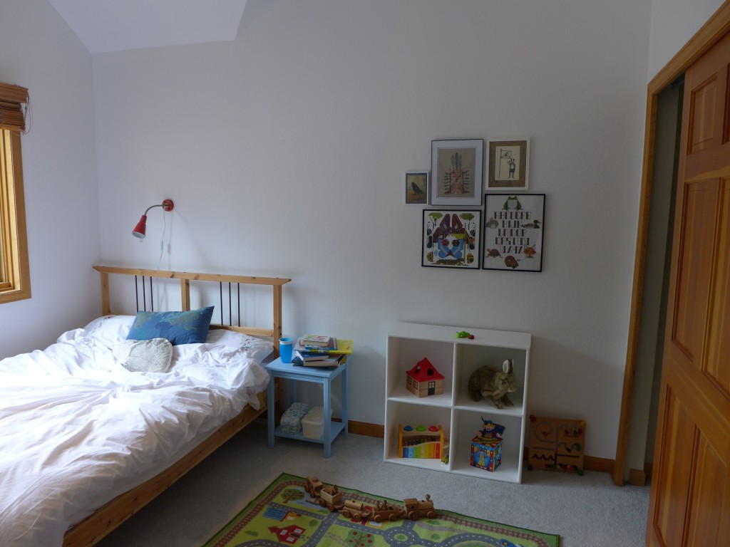
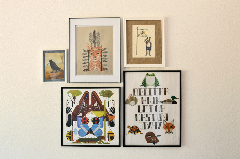
On the wall across from the mountains, we hung a little grouping of art that goes with our woodland theme while keeping things kid-like. The insect print is a page from an old Charley Harper calendar that I saved and framed. The alphabet sampler was made by our mom, and each of the animals in it are all Charley Harper designs that she cross stitched with charts from here. The uber cute fox with a headdress and badger scout pieces are from Coral & Tusk (I wish I owned everything she makes!). The badger is a card that I framed over a piece of old burlap, but unfortunately, it doesn’t look like that card is in their current collection. The crow in boots is a postcard of a painting by Rudi Hurzlmeier.
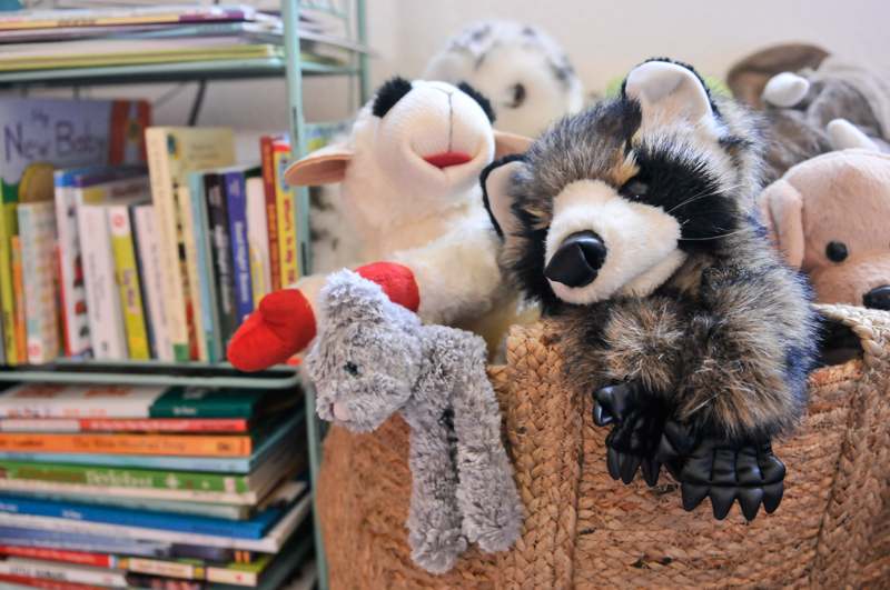
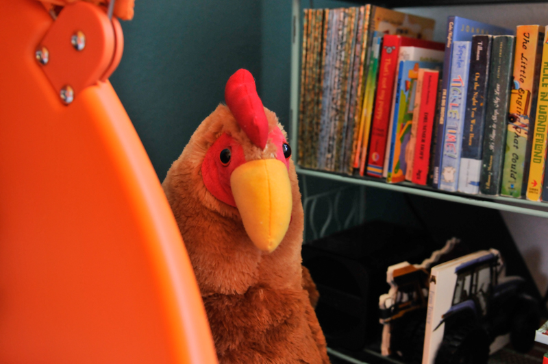
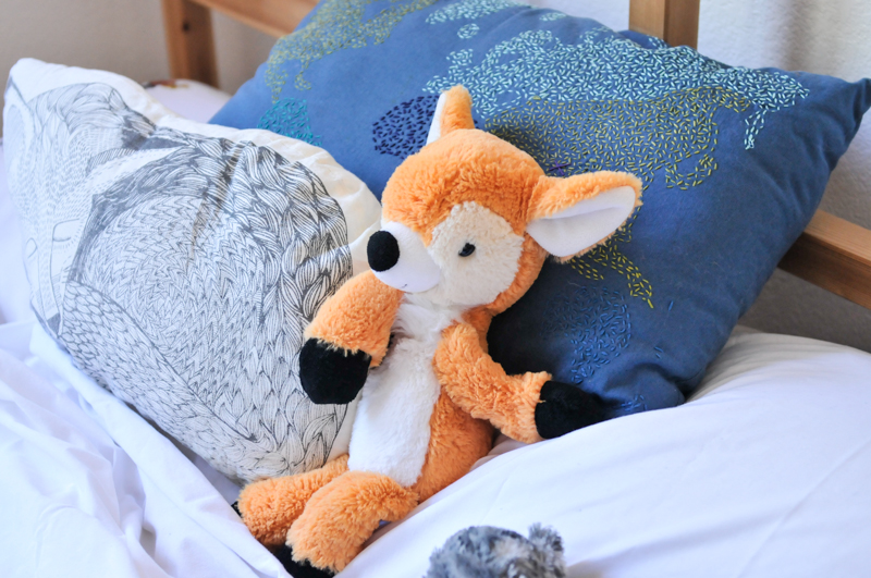
In one corner of the room we created a little reading area with a small bookshelf (that link is to the same one but different color) and this awesome chair. Even though he can’t read, I wanted to encourage the habit and create a space for him to look at books, because he’s just entering the stage where he will sit down for a few minutes with his favorites and study the pictures. We also put his stuffed animals in that area, so that he can easily reach for something to cuddle if he wants it. Plus, a lot of his animals are puppets, making it fun to start putting on little shows with the puppets reading the books.
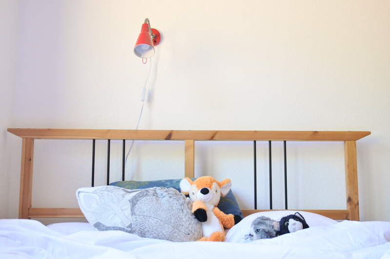
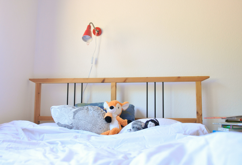
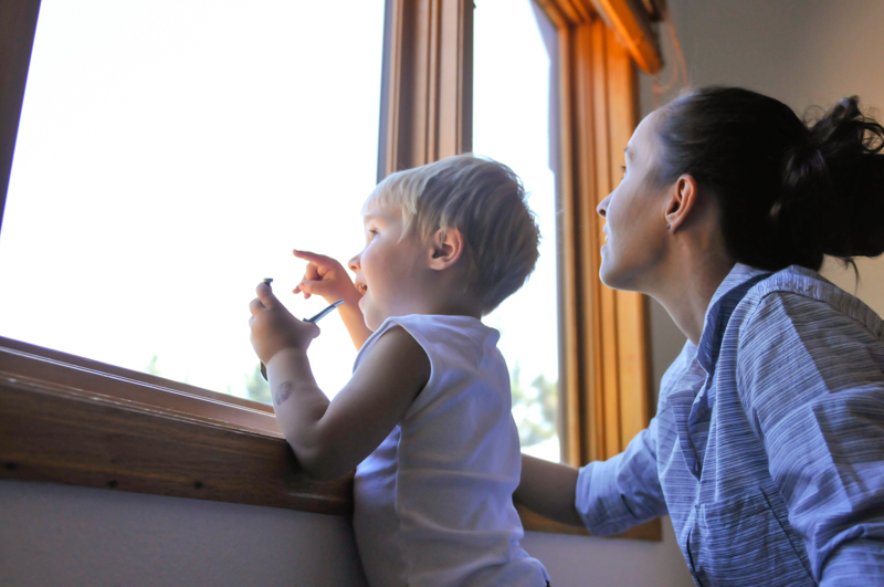
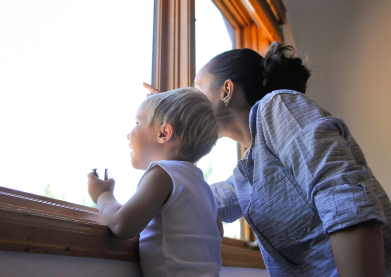
His bed is something that I’ve had from grad school. It’s an old discontinued Ikea model, and I’ve loved it enough to cart it from Boston to PA to Colorado. I think it’s made a great first bed for Alex. It’s full size, giving him plenty of space to roll around and/or for one of us to curl up with him for story time. It’s also fairly low to the ground (there’s no boxspring), so if he were to fall out of bed, the damage would be to his ego more than his noggin. We added the light above his bed for reading. It has a switch on the cord, and I was worried that he would stay up late turning it on and off, but we’ve been really lucky so far in that he rarely, if ever, tries to turn it on (even though he definitely knows how). We realize the danger that could exist from putting a bed next to windows, but the windows over his bed are locked and can’t be opened. We decided to take the screens out of the windows over his bed to give us an even clearer view when we’re watching “our” hawks circle the mountainside.
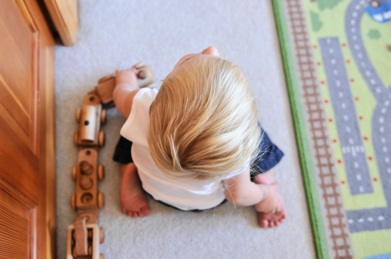
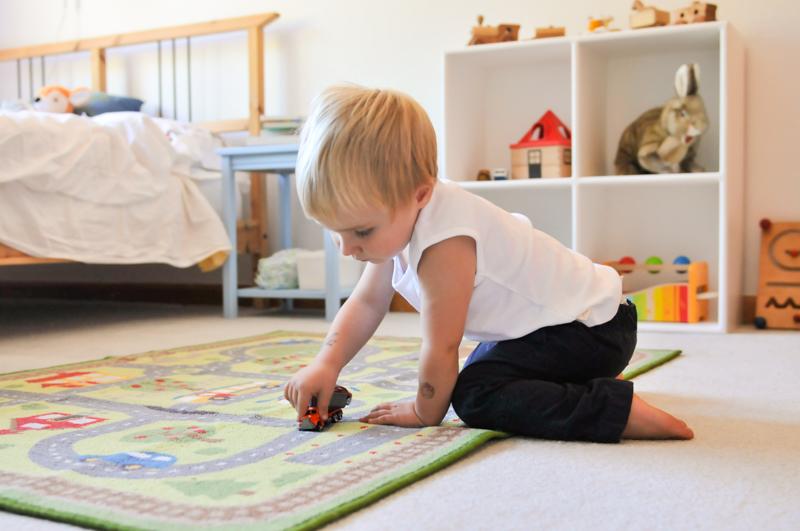
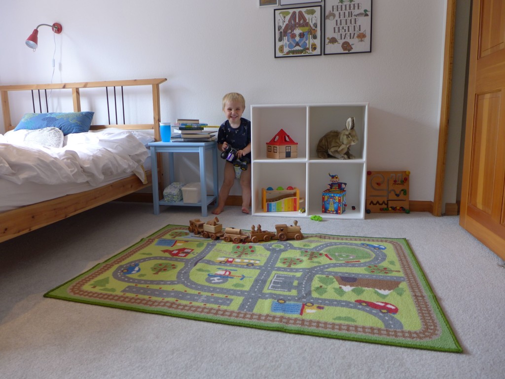
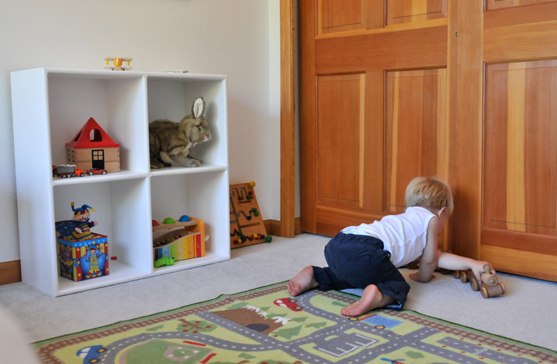
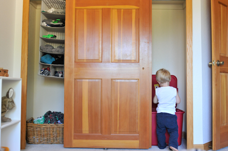
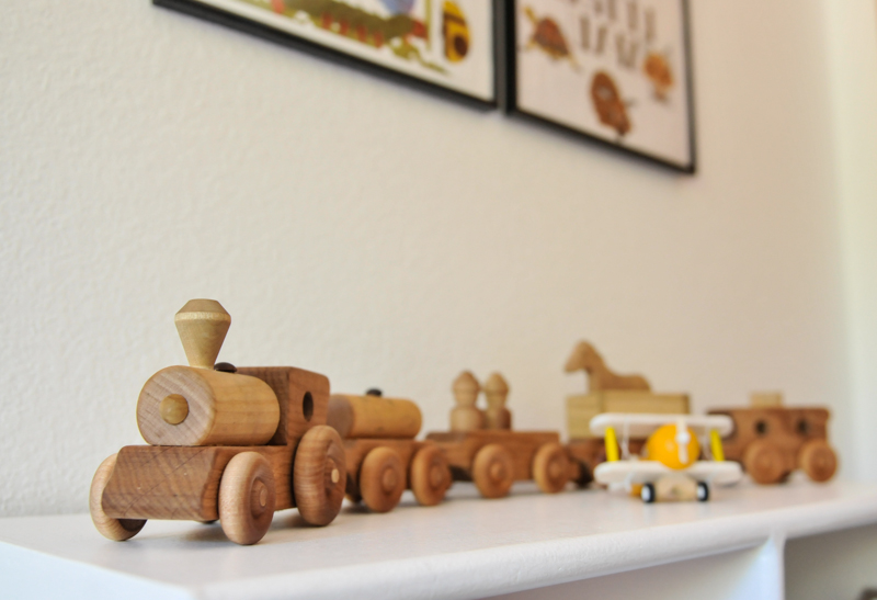
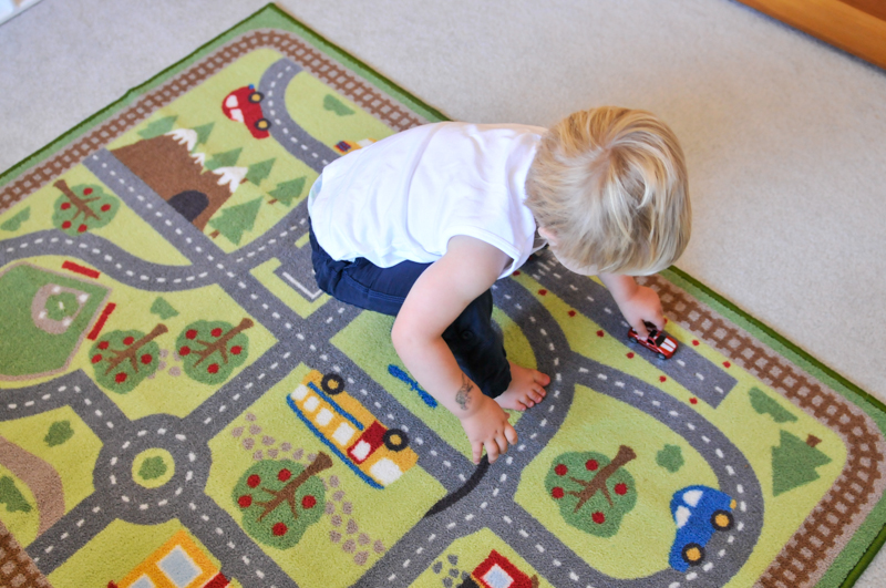
Next to his bed is a simple side table to hold his water cup, growing stack of favorite books, diapers, and wipes. And along that same wall, under the art is a small 2×2 cubby. Both the table and the cubby are from the Unfinished Furniture store in Boulder. I finished them using leftover paint from the room. We use the cubby to display a few toys at a time. The rest of the toys are stored in bins in his closet. He loves anything cars/trucks/trains, and this rug has been a hit, and I like that it adds a bit of color to the beige carpet!
And with that, you’ve seen Alex’s new room! What do you think? The renovation, and especially the mountains, make such an impact when you see them in person. Personally, I love how the room turned out. It’s as light and fresh as we could have hoped for. It’s also uncluttered, giving him plenty of room to play, and I like that we were able to create a few obvious zones with the reading area in one corner and the toy cubbies and road rug in another.
If you have any questions, or want any other source detail, let me know!

oh my cuteness!!!! his room looks SO AMAZING!! light and fresh are the perfect words to describe it. All the details are so perfect and meld so nicely together, great job K! We are itching to make a trip out to see it in person. xo